Five things I learned shooting black and white
Colour tells you what something looked like. Black and white tells you what it felt like — here's how I decide which photographs get which.
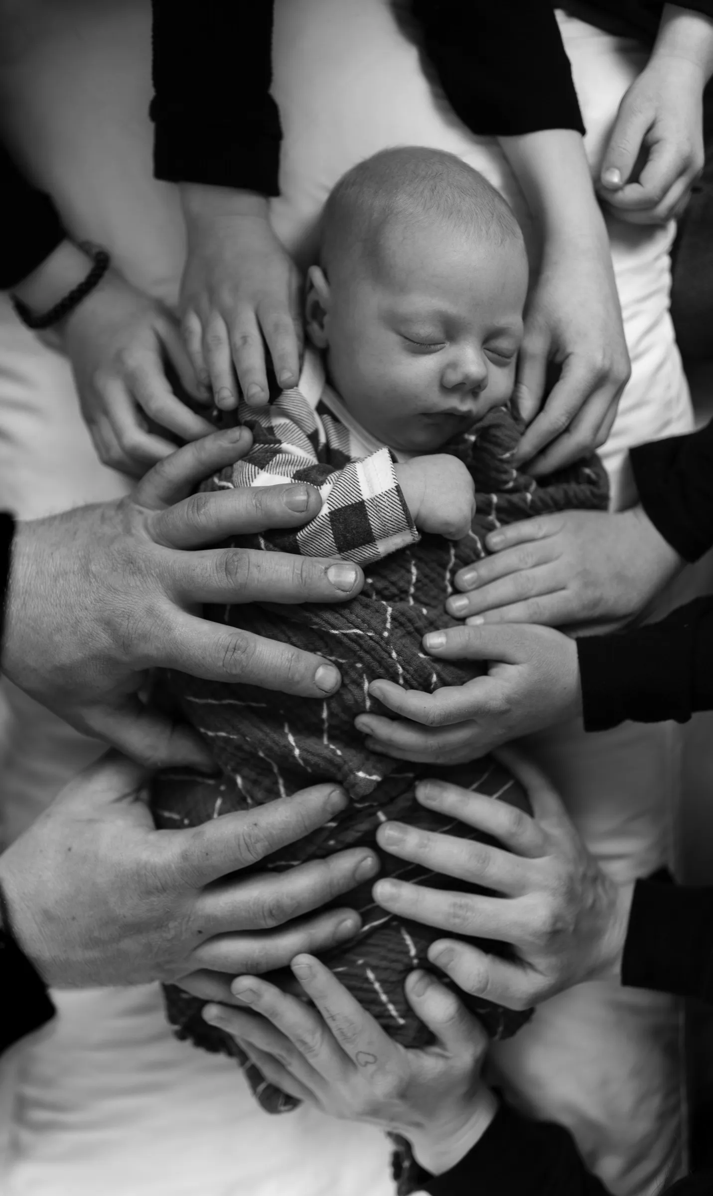
I convert maybe one photograph in six to black and white, and I’ve become fairly strict about which ones. Here’s how I decide.
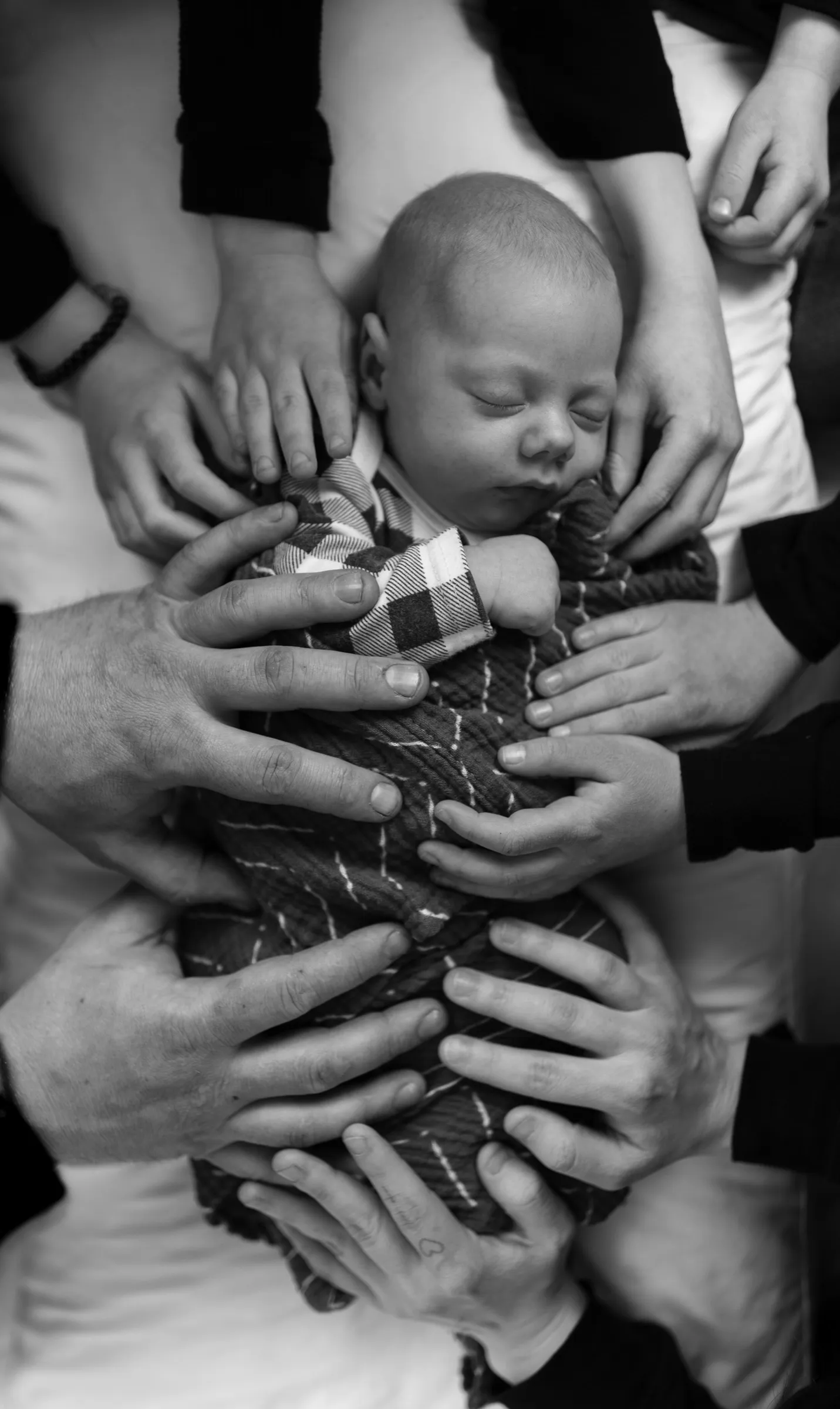
1. Black and white is for feeling, colour is for fact
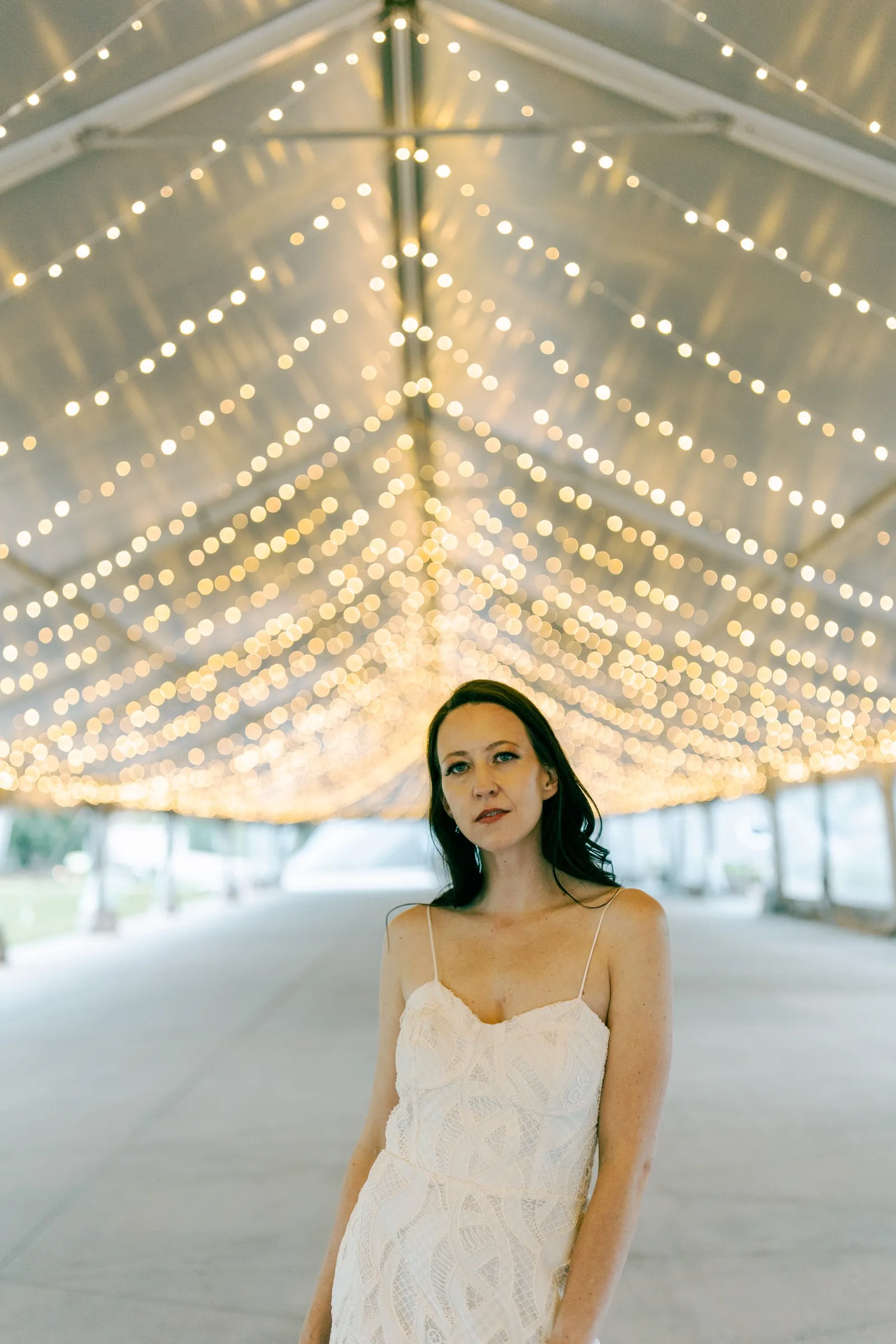
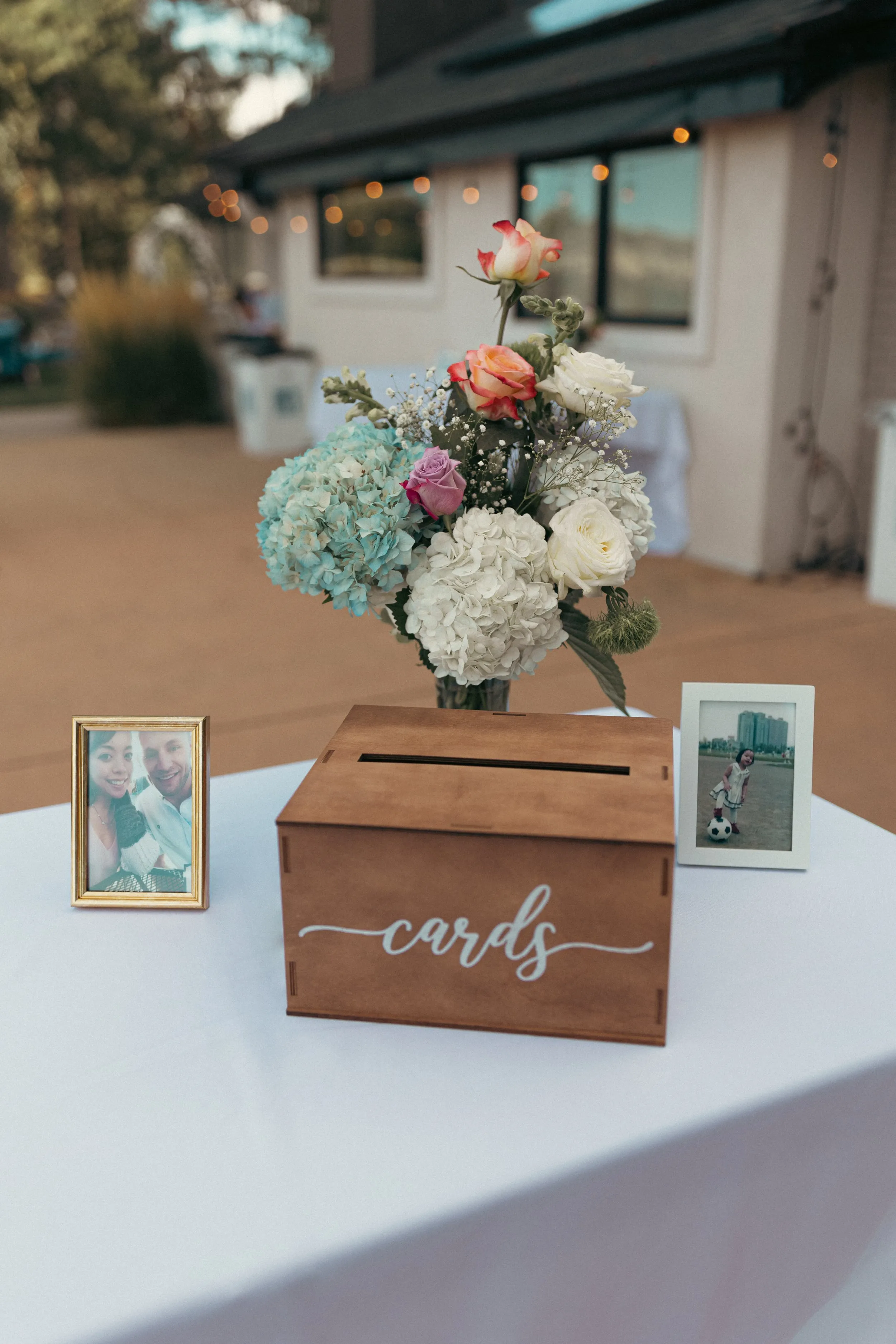
If the point of the photograph is what something looked like — the dress, the flowers, the light through the aspens — leave it in colour. You’ll want the fact of it later.
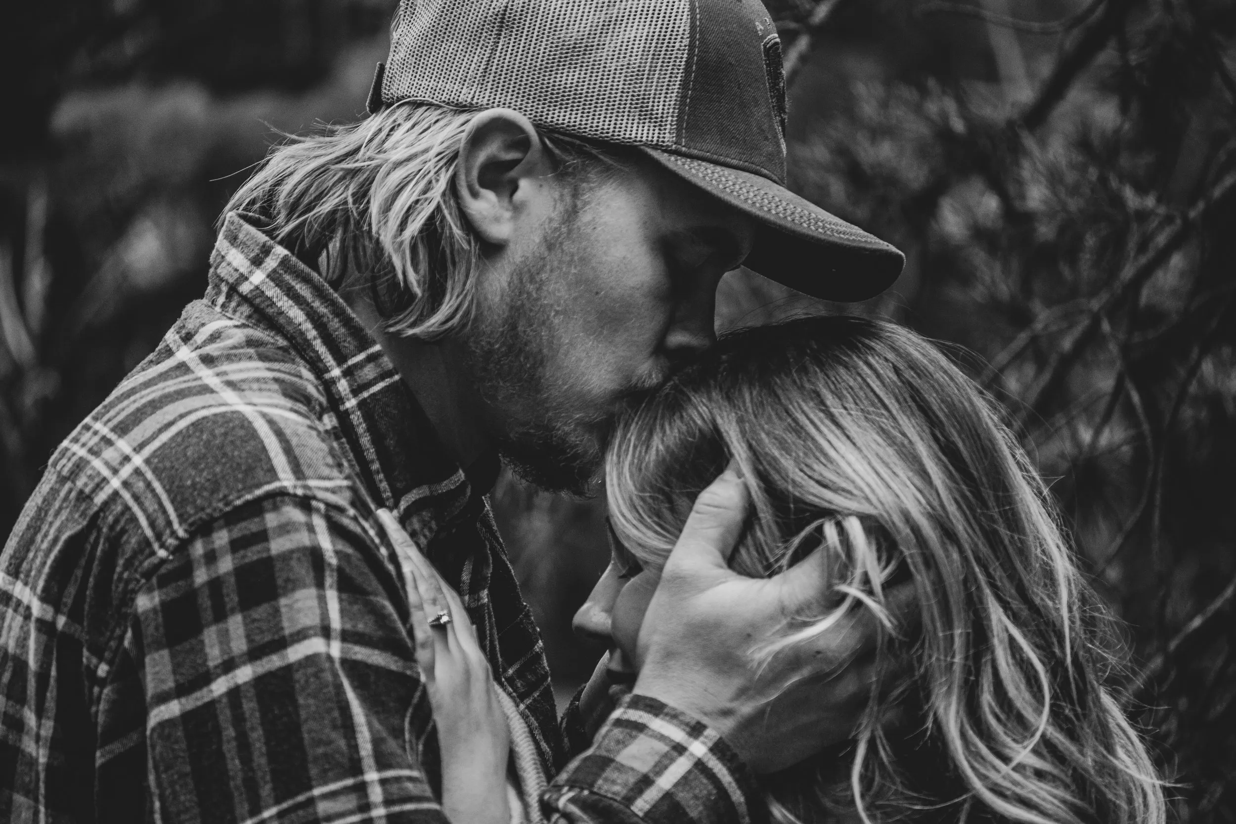
If the point is what it felt like, take the colour out. Nothing else strips a photograph back to gesture and expression so quickly.
2. It fixes light you couldn’t control
Reception venues light people in four different colours at once. Tungsten from the ceiling, green from an exit sign, magenta from a DJ, daylight from a door somebody propped open. You can fight that for an hour in Lightroom or you can convert it and be done.
This is the single most practical use of black and white at a wedding, and I use it constantly.
3. Look for contrast, not for colour
The photographs that convert best are the ones with a real tonal range in them already — a dark suit against a pale wall, a window throwing hard light, a shadow with shape to it. Flat, even, pretty light usually makes a flat, grey, disappointing conversion.
If you squint at the colour version and it goes to mush, it will go to mush in black and white too.
4. Skin is the thing you’ll get wrong
Most bad conversions are bad because the skin has gone grey and lifeless. Pull the orange and red channels up in the black-and-white mixer until faces separate from whatever is behind them. It’s one slider and it’s the difference between a photograph and a photocopy.
5. Don’t do the whole gallery
A gallery that’s entirely black and white stops meaning anything — the choice has to be a choice. I’d rather deliver forty deliberate conversions than four hundred automatic ones.